URL
g-steel.gr
Client
G-Steel Metal
Category
Logos
About the project
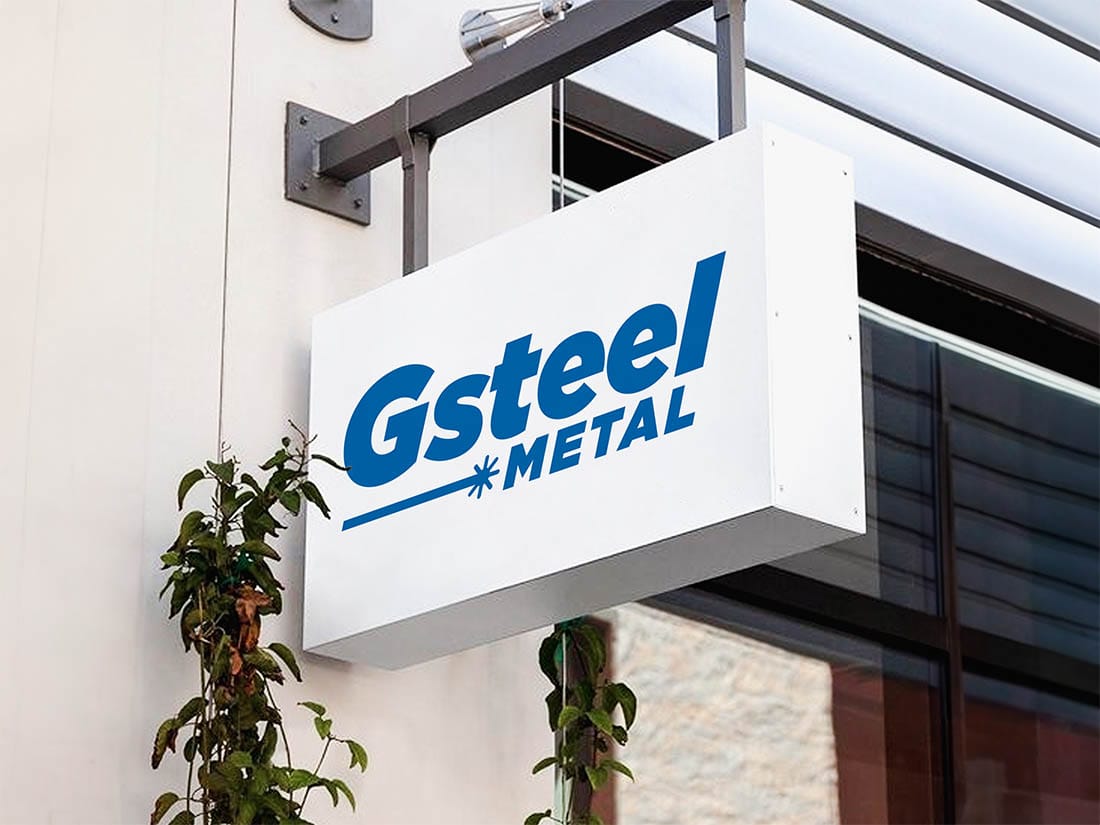
For the G-Steel Metal logo, a metal cutting and fabrication plant, the symbol is the process itself: a horizontal beam running across the wordmark and ending in a burst, the instant the laser meets the sheet.
The heavy italic wordmark carries speed and force, while METAL sits below at a smaller size as a qualifier of what the company actually does. The asymmetry between the two keeps the composition alive rather than symmetrically aligned.
Blue was chosen for its association with industrial precision and reliability, kept to a single shade across all applications so the mark reproduces correctly in engraving, vinyl, workwear and vehicle livery. In single-colour print the beam and the burst stay recognisable.