Brand book Rent A Crate

The book
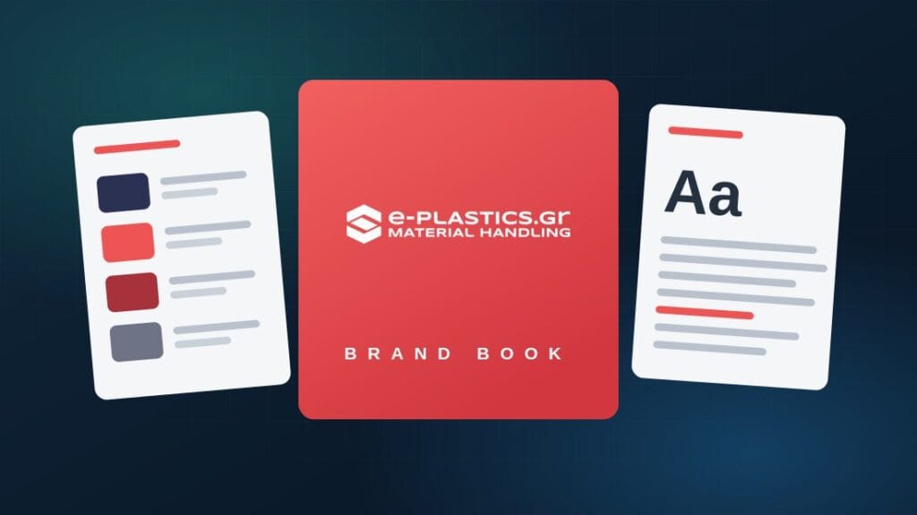
Cover of the Rent A Crate brand book
Cover
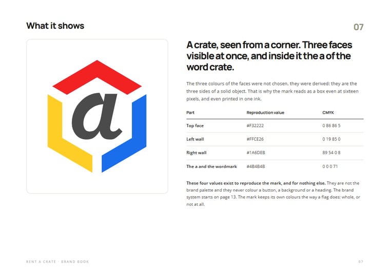
The brand book page explaining what the mark shows
What the mark shows
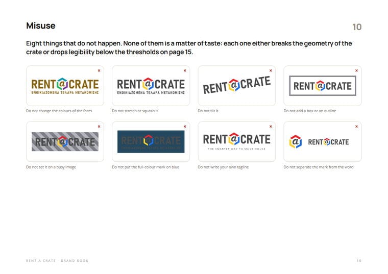
The page listing the eight things that do not happen to the logo
Eight things that do not happen
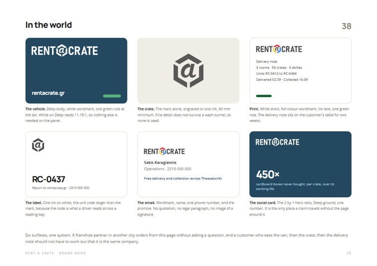
The applications page: vehicle, crate, delivery note, label, card
Six surfaces, one system
Forty sheets in A4 landscape, from the mark to the sticker that goes on the crate.
Colour
Signal Blue#0E6BA8 · 5.70:1Whatever you press
Deep#23485F · 9.71:1Dark surfaces
Steel#102A3C · 14.80:1Footer, greyscale
Field#176034 · 7.61:1Proof
Stone#6E6A5F · 5.40:1Bands, secondary text
Proportion
60% white and paper · 22% warm stone · 10% signal blue · 5% deep · 3% field
The bar is drawn to those exact shares. Field appears roughly once per screen: if it is everywhere, it is nowhere.
Typography
Manrope
Headings, figures and prices. Weights 700 and 800.
Open Sans
Body, forms and tables. Weights 400, 600 and 700.
Both carry a full Greek and both are open source. A franchise partner in another city never buys a type licence to print a leaflet.

URL

rentacrate.gr

Client

Rent A Crate

Category

Branding & Strategy

About the project

Sensis Media wrote the brand book for Rent A Crate, the company that rents reusable moving crates instead of selling cardboard. Forty sheets that start at the mark and end at the sticker on the crate, the vehicle and the delivery note.

The mark does not decorate, it describes: a crate seen from a corner, three faces visible at once, and inside it the «a» of the word crate. The three colours were not chosen, they were derived, because they are the three sides of a solid object. That is why it reads as a box at sixteen pixels, and even printed in one ink.

The book was written to survive a second city: it states what never changes when the next branch opens and what a partner may adapt. The platform behind the shop was already ours, in the custom platform rentacrate.gr.

Rules

Blue says press me, green says this one is true. Signal Blue only on what a visitor touches, Field only on a number that survives a check. Headings stay ink, never a brand colour.

The colours of the mark never paint the interface. Red, yellow and blue belong to the logo and nowhere else: not a button, not a background, not a heading.

Proof is published whole. The registry digest is never truncated and never a button. It is evidence, not an action.

450 CARDBOARD BOXES NEVER BOUGHT

How an environmental claim becomes something you can check

BOXES PER CRATE
40
SHEETS OF BRAND BOOK
5
COLOURS, NOT ONE MORE
6
RULES OF TONE
1
LINE OF ARITHMETIC
CLIENT: RENT A CRATE, THESSALONIKI

A crate replaces one cardboard box per move and survives roughly 450 trips before it retires and returns as raw material. That is the whole calculation. The only input is the trip rating, and it is published together with its source: until it is published it is an assertion, once published it is evidence.

From 27 September 2026 the EU prohibits generic environmental claims without demonstrated performance. The competitor still writing «eco friendly» is left holding a word nobody can check. Here the claim is checked with one addition.

And it never opens. Price and convenience close this sale. The 450 is the argument the customer keeps to justify the choice to somebody else, which is why it always comes second. On the page it is worth 3%: green speaks once, and only where there is a number.

Want something like this?

Tell us what you need and we will send you a proposal. We reply within one business day, with a written quote.